Four parts of brand messaging:
At Trane Technologies, we are proud to have a history of setting bold goals and exceeding expectations. Now, we’re intent on inspiring others to rise to the global challenges facing us all.
To empower our work, we have a brand identity system that represents our values and strengths.
This brand center provides guidance on using the visual and verbal elements of our brand identity system. Familiarity with these guidelines will help you create communications that effectively convey our brand strategy and advance our brand position as a leader in innovative, sustainable, and cutting-edge technologies. If you have questions about the visual identity or would like more direction please contact brand support.
Our Brand Story
Challenge Possible
Our world contends with unprecedented challenges. Urbanization is dramatically reshaping our communities, our resources are more constrained than ever before, and climate change is accelerating at an astonishing rate. At Trane Technologies, we view this as a call to lead. It inspires us to think bigger, act bolder, and take actions that not just improve our own performance but influence global change.
With sustainability embedded in all that we do, we have a responsibility to push the boundaries of possible. As a climate control leader, we operate exactly where global megatrends and innovation intersect, giving us a unique ability to envision audacious solutions for our customers and for the world. Leading a coalition of our peers, customers, and partners, Trane Technologies is redefining what’s possible for a more sustainable future.

Logo

Our logo uses the simplest possible forms to make a powerful impression. This reflects our belief that innovation in sustainability is driven by precise and considered actions.
The letter A in our logo is crafted to create a symbol representing uplift. This is a call to action rooted in our optimism and constant drive to improve.
We use Trane Technologies Purple as our signature color to represent the union of our strategic brands, Trane (red) and Thermo King (blue), coming together in a vibrant and modern way.
The two-color logo is our primary logo and should always be used, unless the background does not provide sufficient contrast for legibility of the full color logo, such as over busy photography.
The black logo should be used only when required by a production condition, such as in grayscale newsprint.
The white logo may be used when the background does not provide sufficient contrast for legibility of the full color logo, such as over busy photography.
Color Palette
Primary Colors
Purple is our primary brand color and is both distinctive and vibrant. Black provides a grounded, strong, confident feel. White creates a sense of freshness and possibility, while Gray provides a balancing neutral.
Be careful to not overuse Trane Technologies Purple. We want to build equity in the color but not oversaturate every marketing material and visual impression with it.

Trane Technologies Purple
Pantone: 2098 C
CMYK: 78 / 79 / 0 / 0
RGB: 100 / 0 / 255
Hex: #6400FF

Black
CMYK: 0 / 0 / 0 / 100
RGB: 0 / 0 / 0
Hex: #000000

White
CMYK: 0 / 0 / 0 / 0
RGB: 255 / 255 / 255
Hex: #FFFFFF

Gray
CMYK: 0 / 0 / 0 / 31
RGB: 191 / 191 / 191
Hex: #bfbfbf
Typography
Preferred
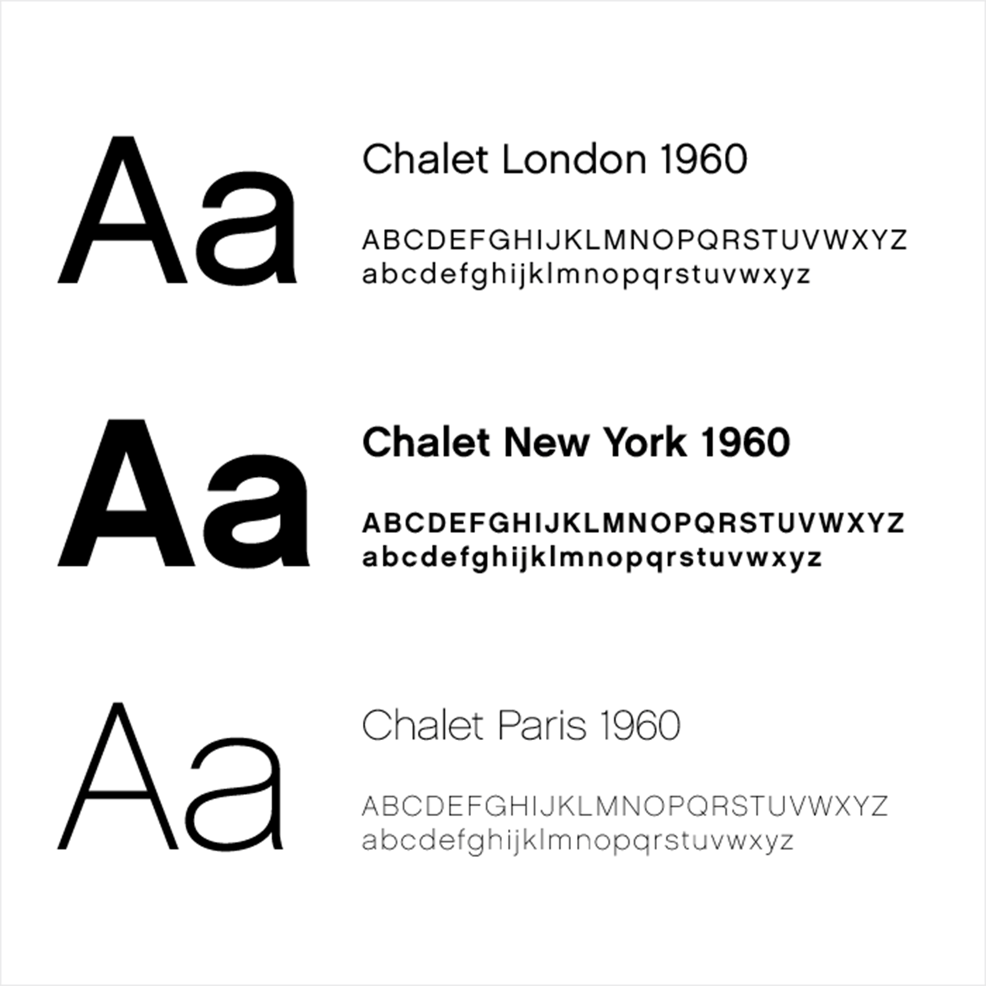
Our primary brand typeface is Chalet. Use this typeface for all
communication applications unless there is a strongly prohibitive
licensing or technical reason. Its distinctive style allows for a
variety of uses, from text to display applications.
We use only the minimalist “NineteenSixty” cuts of Chalet that are shown here.
Alternative
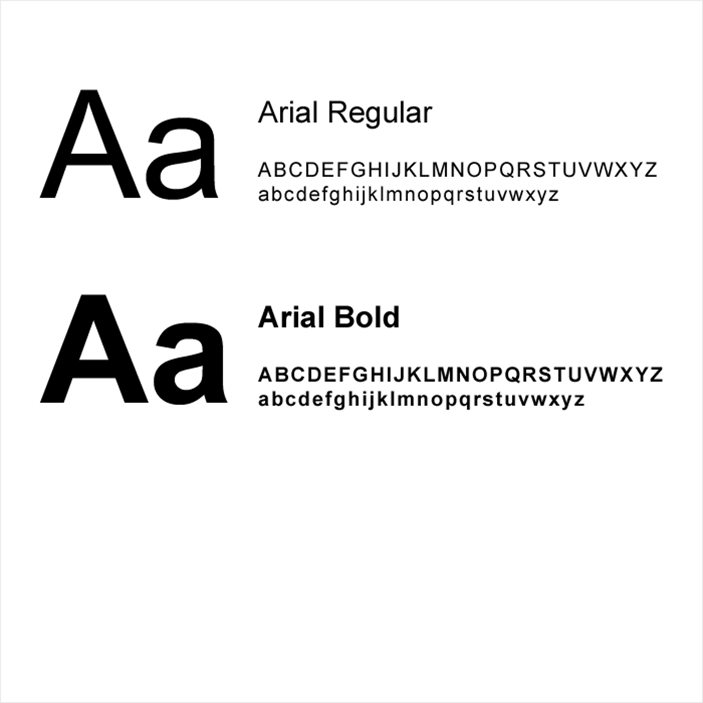
Use Chalet whenever possible, but for circumstances where Chalet is unavailable or can’t be used our default typeface is Arial.
Arial is a free and publicly available font that is preloaded on most computer systems. Arial can be used without special licensing.
Uplift Symbol
The Uplift symbol is a key part of our visual identity, helping to convey our values and ideals in a distinctive, abstract form. It is a supporting graphic element that may be used in conjunction with the Trane Technologies logo, but it never replaces the logo.
Overview
This symbol is designed to suggest confident optimism with its upward point, strong progress with its stable foundation leading to an angle, and cutting edge innovation with its clean, sharp lines. The various versions of our Uplift symbol help to reflect agility, creativity, and flexibility.
The Uplift symbol should be used consistently to help build recognition of our brand and always be shown pointing directly upward. In general, use only one Uplift symbol in any viewing area.
The Uplift symbol is considered a piece of artwork and should not be recreated.

Usage
We have four versions of the Uplift symbol, which should always appear in Trane Technologies Purple or white. These multiple versions provide flexibility to our diverse communication needs, helping to reflect our agility and creativity.
Always ensure legibility and clarity. Never use purple versions of the symbol on solid colored backgrounds.
Solid symbol versions must be used in their entirety in a layout. Do not crop the solid Uplift symbol. Outlined versions should always bleed off one or more sides of the layout. They do not need to bleed equally off each side. Avoid creating layouts with the Uplift symbol positioned with only the bottom portion bleeding; this can create a cropped look that is off-brand.
To help build recognition of this brand element, always use the provided symbol assets with their original line widths and angles.
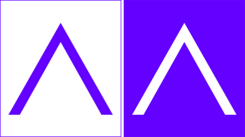
The solid Uplift symbol is always either Trane Technologies Purple or white.
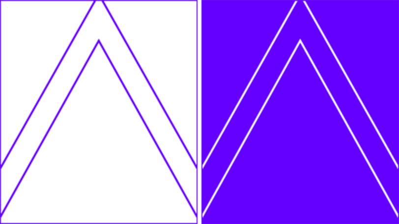
When using an outlined Uplift symbol, allow it to bleed over the edges of the frame as shown above. The bleed does not have to be symmetrical.
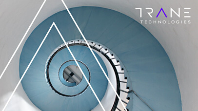
Use a cropped outline of the Uplift symbol that bleeds over the edges of an area.
Photography
Our photography is organized into a variety of categories that help to support our diverse communication needs. All photos are carefully selected to support the strategy behind our branding system.

Portraits
People are at the heart of our company, and we are proud to employ and serve a diverse community of individuals. It’s imperative to communicate that the company is a human-centric company.

Aerials
Aerial photography helps to suggest the big scale of our goals, our work, and our impact. They can also help to suggest our core values in global sustainability by showcasing natural environments or built elements interacting with nature.
Uplift Symbol
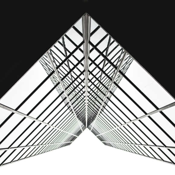
We use photography of buildings in “apex angle” both to reflect the shape of our brand Uplift symbol and the dynamic markets we operate in. The most important rule is that the photos, or architecture, reflect similar angles to the Uplift symbol, rather than going wider or narrower.

Moving Upward
When specifically trying to convey a positive, optimistic feel with a layout, a secondary option is to use “worms-eye” view photography. This is essentially the opposite angle of the top-down aerial shots - pointing up to the sky instead of directly down towards the ground.
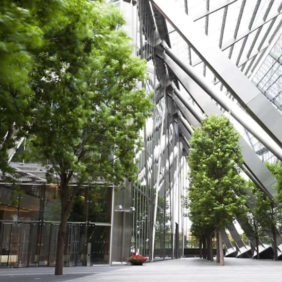
Human Perspective
Photos shot from an average human perspective help to immerse the viewer in a context in a more relatable manner. These photos may show environments related to the work we perform or settings our work may help to influence.
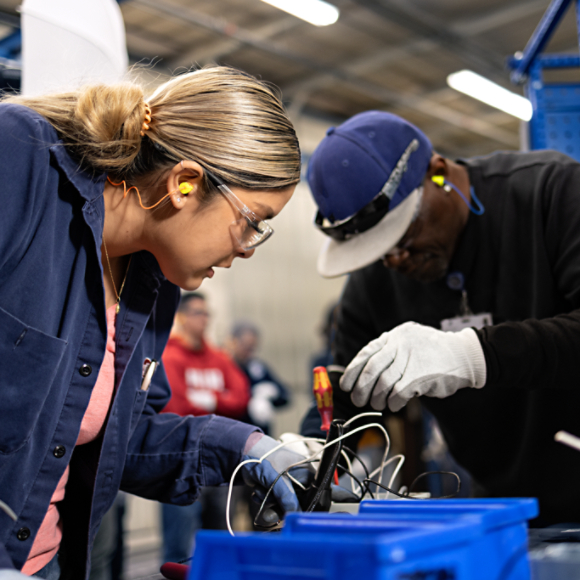
Teamwork
When showing people and teams at work, use the “human perspective” where possible. Images of people working together can be shot at a variety of angles but needs to be at human eye level to add drama and a sense of action to our communications.

Product - Wide
When featuring products in wide-angle or full view, try to use warm or cool tonality to reflect the product’s functions. Wide-angle shots of our products showcase the scale and breadth of our productions, and can provide some context to the communication.

Product - Macro
Macro photos help to celebrate the quality of our products and to create beautiful ”feature” photography that highlights the innovation, thoughtfulness and attention to detail we bring to our work. These photos may take on a more abstract look, which can provide additional flexibility to our communications.
Messaging
Brand messaging is a practical set of high-level pieces that can be mixed and matched within our content to help the world understand critical aspects of our brand.
This messaging helps us tell the story of our brand strategy. It’s meant to be evergreen, used over a period of years. Other messaging may also be created for specific campaigns or special topics.

What we do

Why we do it

How we do it

Who we are
Voice
It’s not about sounding good — it’s about writing thoughtfully to create the right dynamic with key audiences. It helps us demonstrate our leadership, showing rather than telling the world that we’re driving system-wide change.
Guiding Principles
We are always
- Visionary. We’re optimistic and ambitious.
- Resolute. We’re committed and determined.
- Passionate. We’re ready to share our emotions and enthusiasm.
- Knowledgeable. We have expert understanding.
We are never
- Unrealistic. We know big goals require a practical plan.
- Myopic. Our focus doesn’t cause us to lose sight of the big picture.
- Irrational. Our dreams are fed by science and proof.
- Esoteric. Our expertise is expressed in an accessible way.
Writing Principles
1
Break It Up
2
Drop Excess Formality
3
Remember It’s A Movement
4
Visuals Communicate Too
5
Less Is More
6
Use Simple Language
